In the world of Six Sigma, data is king, and visuals are the crowns that help us make sense of it all. Visual tools like Pareto charts, histograms, scatter plots, and control charts aren't just fancy images to fill a report; they are essential instruments for translating raw data into actionable insights.
Let’s think of them as our special pairs of glasses that allow us to see patterns, detect trends, and identify outliers in our data. They work as our navigational aids, guiding us through the sea of numbers and helping us make more informed decisions. Understanding their purpose and how to effectively use them is key to unlocking their true potential.
For example, a Pareto chart isn't just a fancy bar graph; it helps you identify the most important factors among a set of variables, while a control chart isn't just a line graph; it monitors the stability and predictability of a process over time.
The great thing about these tools is that they cater to different types of data analysis needs. Whether you're trying to uncover the root cause of a problem using a fishbone diagram or identifying potential correlations between two variables with a scatter plot—there's a visual tool for every analytical challenge.
Understanding each visual tool's strengths and applications can not only enhance your analytical skills but also empower you to make more informed decisions based on reliable data insights.
As we continue to journey through the landscape of Six Sigma visualization methods, let's now delve into the powerful realm of Run Charts.
Let us learn about a few Representation Tools that help us in analyzing the data and also representing them appropriately.
Process variation can be classified as Variation for a period of Time and Variation Over Time. Variation for a period of time can be defined for discrete and continuous data types as below:
Variation Over Time can be defined for discrete and continuous data types as:
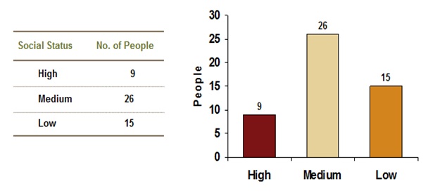
A bar diagram is a graphical representation of attribute data. It is constructed by placing the attribute values on the horizontal axis of a graph and the counts on the vertical axis.
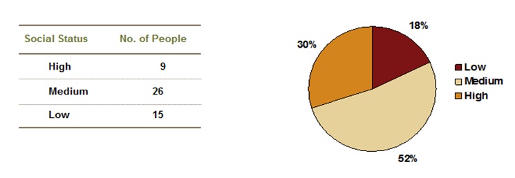
A pie chart is a graphical representation of attribute data. The “pieces” represent proportions of count categories in the overall situation. Pie charts show the relationship among quantities by dividing the whole pie (100%) into wedges or smaller percentages.
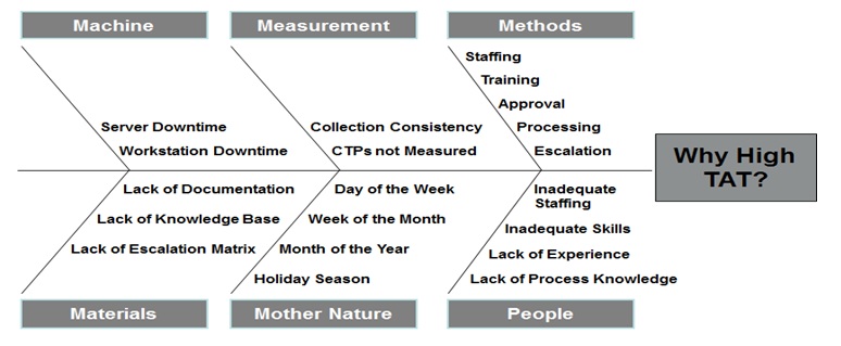
This is a visual tool used to brainstorm the probable causes for a particular effect to occur. Effect or the problem is analogously captured as the head of the fish and thus the name. The causes for this effect or problem is generated through team brainstorming and are captured along the bones of the fish. The causes generated in the brainstorming exercises by the team will depend on how closely the team is related to the problem. Typically the causes are captured under predetermined categories such as 6M’s or 5M’s and a P as given below:
Below is an example of a fishbone diagram created for capturing the root causes of High Turn Around Time (TAT).
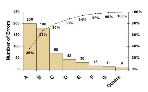
A data display tool for numerical data that breaks down discrete observations into separate categories for the purpose of identifying the "vital few".
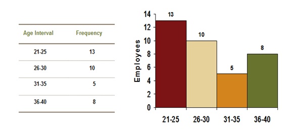
A histogram is a graphical representation of numerical data. It is constructed by placing the class intervals on the horizontal axis of a graph and the frequencies on the vertical axis.
A box plot summarizes information about the shape, dispersion, center of process data and also helps spot outliers in the data.
The box plot can be interpreted as follows:
Below is an example of a call center process where Average Handle Time (AHT) of the calls is compared between Team Leads of the process.
You will observe that the variation is highest for TL1 and for the rest it is much smaller. This indicates that the associates working under TL1 need training or some other help which will reduce the variation and bring the overall AHT under control.
A scatter plot is often employed to identify potential associations between two variables, where one may be considered to be an explanatory variable (such as years of education) and another may be considered a response variable (such as annual income).
Scatter plots are similar to line graphs in that they use horizontal and vertical axes to plot, large body of, data points. And, they have a very specific purpose too:
Once after identifying the factors we need to
The term "run chart" itself is quite self-explanatory. It's akin to a visual record of how things are running, documenting the performance of a process or system over time. This makes it an essential tool in the world of Six Sigma as it showcases how processes change and fluctuate from one period to the next. By presenting data points in chronological order, run charts highlight trends, cycles, and shifts in the data, offering valuable insight into how processes perform over time.
Unlike other Six Sigma charts that deal with comparing multiple categories or cause-and-effect relationships, run charts focus solely on displaying a single data series along a timeline. This makes them especially useful for detecting patterns and changes in process performance over time, irrespective of the causes behind those changes.
For instance, let’s consider tracking customer service call wait times. Each data point represents the average wait time for a certain day. By plotting these points on a run chart, you can easily see if there are any consistent trends - maybe wait times are longer on Mondays or decrease on Fridays. In response to these patterns, you might adjust staffing levels or implement process improvements to streamline operations during peak periods.
Similarly, in a manufacturing setting, run charts can be used to monitor equipment downtime, allowing for identification of patterns that reveal underlying issues contributing to decreased productivity.
Furthermore, by studying run charts over longer periods, organizations can identify gradual improvement or deterioration in process performance, allowing them to make informed decisions based on historical data trends.
As we delve deeper into the intricacies of run charts, it becomes clear that they provide invaluable insights into process performance and act as navigational tools for driving continuous improvement initiatives. Understanding their significance and effectively interpreting the information they convey fosters informed decision-making within the realm of Six Sigma methodology.
Now that we've explored the role of run charts in analyzing process performance, let's turn our attention to another fundamental visualization tool: Understanding Bar Charts.
Bar charts act as visual storytellers, aiding in the comparison and comprehension of data. For example, when comparing different fruit sales at a local market, a bar chart swiftly reveals which fruit sells the most and which sells the least.
This straightforward yet powerful tool offers an intuitive way to showcase comparisons between different categories, highlighting trends, patterns, and discrepancies across various groups.
Using a bar chart to present the number of defects in different departments within a company can assist decision-makers in quickly pinpointing areas that require improvement and effectively allocating resources.
The length or height of each bar corresponds to the quantity or frequency of the category it represents, facilitating the clear identification of the category with the highest or lowest count or frequency.
Constructing a bar chart necessitates attention to key steps to ensure accurate conveyance of categorical data.
Key Steps for Constructing Meaningful Bar Charts:
Understanding these critical components enables the construction of accurate and impactful bar charts for Six Sigma projects, facilitating easier interpretation and communication of data.
With insight into constructing insightful bar charts achieved, let's now transition our focus to unraveling the mysteries of scatter diagrams—another vital tool for data visualization.
When it comes to understanding how two different variables might be related, scatter diagrams are a vital tool in the Six Sigma toolkit. These diagrams help us see if there's a connection between the two variables, and if there is, what kind of connection it is. For example, let's say you're studying how the temperature outside affects ice cream sales; a scatter diagram helps you see if more ice cream is sold when it's hotter.
The way scatter diagrams work is simple. We take pairs of data - one for each variable we're looking at - and plot them on a graph with one variable along the horizontal axis and the other along the vertical axis. The points then scatter across the graph, forming a pattern that can tell us a lot about how these two variables might relate to each other.
A positive correlation shows that when one variable increases, the other also increases. On the other hand, a negative correlation means that as one variable increases, the other decreases. And if there's no clear trend or pattern, it indicates a neutral correlation.
Imagine plotting points for student study hours and their test scores. If you see a trend where as study hours increase, test scores also increase, you have a positive correlation. However, if there's a trend where an increase in study hours leads to lower test scores, you have a negative correlation.
However, it's important to remember that just because two things happen at the same time doesn’t mean they cause each other. It's like saying that since more people wear sunglasses on sunny days, sunglasses cause sun! Correlation doesn't imply causation.
That's why alongside scatter diagrams, it's essential to use additional statistical methods to establish causation. Such as hypothesis testing and regression analysis to determine whether there's a direct cause-and-effect relationship between the variables being studied.
Understanding scatter diagrams gives us an incredible insight into how two variables interact with each other. But knowing how to interpret this information effectively requires skill and thorough analysis. Let's now delve deeper into interpreting scatter diagrams for more effective data analysis purposes.
Control charts are invaluable tools in the Six Sigma toolkit for ensuring process stability and identifying variations. By monitoring these charts, practitioners can distinguish between common cause and special cause variations, allowing them to make informed decisions and take appropriate action when necessary. Let's delve deeper into the specific types of control charts and the insights they provide.
One of the most commonly used control charts is the X-bar chart. This chart focuses on monitoring the central tendency or average of a process. By plotting the sample means over time, it provides a visual representation of how the process mean is performing relative to its established control limits. This enables practitioners to detect shifts or trends in the process mean and address them promptly to maintain stability.
Additionally, R charts, which stand for range charts, work alongside X-bar charts to monitor process variability. They track the dispersion within each sample by plotting the ranges of subgroups. This is essential for understanding how consistent a process is in producing uniform outputs. When used in combination with X-bar charts, R charts offer a comprehensive view of both central tendency and variability, empowering practitioners to identify and address any unusual patterns effectively.
When implementing these control charts, it's important for practitioners to interpret the data accurately and understand the implications of any observed variations. For instance, if there are consistent data points that fall beyond the control limits on an X-bar chart, this could indicate a potential issue that requires investigation and corrective action. Such insights enable proactive problem-solving and continuous improvement efforts within an organization.
In addition to X-bar and R charts, there are other specialized control charts designed for different types of processes and data. Each type serves a specific purpose in tracking and analyzing process performance, making it essential for practitioners to have a comprehensive understanding of these charts and their applications.
By facilitating thorough monitoring and analysis of process performance, control charts play a pivotal role in maintaining operational excellence and driving continuous improvement within organizations following Six Sigma principles. Mastering these tools equips practitioners with the knowledge needed to implement effective quality management practices and drive sustainable success.
Now equipped with a solid understanding of control charts and their significance in maintaining operational excellence, it's time to move on to analyzing and comparing visuals in our quest for data-driven insights.
In the realm of data visualization, the myriad options available can be overwhelming. Understanding the strengths, limitations, and ideal use cases of various chart and graph types is crucial for selecting the most suitable visualization method for specific data sets, empowering users to make informed decisions about data visualization strategies.
Imagine going to a restaurant where the menu is not organized or labeled—it would be chaotic and confusing. Similarly, when dealing with data, it's essential to have tools that can organize and convey information clearly and efficiently. Different types of visuals have different uses: some are better for showing changes over time, while others are better for comparing categories.
Bar charts are suitable for comparing data across different categories. They provide a straightforward way to visually compare quantitative data between different groups or categories. Each bar represents a category and the height of the bar corresponds to the value it represents.
Histograms are useful for showing the distribution of a continuous variable. They group data into ranges or intervals along the x-axis and display the frequency (or count) of observations within each range on the y-axis.
Pareto charts highlight the most significant factors in a data set. By arranging categories in descending order from left to right based on their relative frequency or contribution, they help identify the "vital few" issues that need attention.
Let’s consider an example where you're analyzing customer complaints in a call center. A Pareto chart can quickly show you which types of complaints are occurring most frequently, allowing you to focus your efforts on resolving the biggest issues first.
Scatter plots show the relationship between two variables. By plotting data points on a graph, scatter plots help visualize potential associations between variables, which can be essential when trying to identify correlations or patterns in the data.
Understanding these visualizations empowers you to select the most effective method for presenting your data, ensuring that your audience can easily interpret and act upon the information presented.
As we continue our exploration of Six Sigma chart and graph types, we'll look deeper into more comparisons so that you can confidently choose appropriate visualization methods for your specific data sets.
As a Six Sigma professional, creating impactful dashboards and reports is crucial for effectively communicating complex data. These components act as windows to performance metrics, trends, and analytical insights derived from various improvement initiatives within an organization. They provide a concise visual representation of the data, making it easier for stakeholders to understand and interpret critical information.
A well-structured dashboard brings together diverse pieces of information into one coherent view, displaying relevant Key Performance Indicators (KPIs), metrics, and other essential data points in a visually appealing format. This allows quick identification of trends, patterns, and outliers that are vital in decision-making processes.
Moreover, such dashboards are often interactive, allowing users to drill down into specific data sets, filter out unnecessary details, or customize views based on their specific preferences. In this way, stakeholders can focus on the most important aspects of the data and gain deeper insights into ongoing projects or operational processes.
For instance, consider a Six Sigma project manager looking at a dashboard showcasing defect rates for different production teams within a manufacturing plant. The manager can interact with the dashboard to isolate particular time periods, identify root causes for defects, and compare the performance across different shifts or teams. This level of detailed analysis can guide the manager in making informed decisions to drive process improvements.
Now, when it comes to reports, they offer a more comprehensive breakdown of the data compared to dashboards. Reports provide in-depth analysis, often including historical trends, comparative analyses, and statistical summaries. They serve as valuable documentation of project progress, success stories, challenges faced, and the impact of improvement initiatives.
Reports are especially beneficial for conveying detailed findings to higher management or external stakeholders who may require thorough documentation and evidence to support strategic decisions or investments. Additionally, reports play a crucial role in recording the journey of improvement projects—from defining problem statements to implementing solutions and measuring their impact over time.
Understanding how to develop impactful dashboards and reports is key not only in presenting data insights effectively but also in driving continuous improvement initiatives forward.
In conclusion, mastery of effective data visualization through dashboards and reports is essential for not only conveying complex information but also for driving meaningful change within organizations.
A histogram is a vital tool in Six Sigma for data visualization, as it presents a graphical representation of the distribution of a set of data. Its purpose is to identify patterns, trends, and anomalies in the data, helping to analyze process variations and make informed decisions. By displaying the frequency or count of data points within predefined intervals or bins, a histogram provides insight into the shape, center, and spread of the data distribution. This enables practitioners to understand process performance, identify areas for improvement, and assess the effectiveness of process changes.
A scatter plot is a valuable tool in Six Sigma analysis as it helps visualize the relationship between two variables. It allows us to identify patterns, correlations, and outliers in data, providing insights into process performance and potential sources of variation. By plotting data points on an x-y axis, we can determine whether there is a linear or non-linear relationship between variables. Additionally, statistical techniques such as regression analysis can be applied to scatter plots to quantify the strength and significance of relationships. Overall, scatter plots enable better decision-making by uncovering important trends and enabling data-driven improvements in process performance.
The advantages of using a box plot in Six Sigma analysis are that it provides a clear and concise summary of the data, allowing for quick identification of outliers, central tendency, and variability. Box plots also allow for easy comparison between different sets of data and help in understanding the distribution of the data. Additionally, box plots can visually depict important statistics such as median, quartiles, and potential skewness or asymmetry in the distribution. This visual representation aids in identifying patterns and trends in the data, which is crucial in Six Sigma analysis.
A control chart is a statistical tool used in Six Sigma to monitor and analyze the process performance over time. It helps identify if the process is stable or exhibiting any special cause variation. By plotting data points on the chart, deviations from the mean and established control limits can be easily detected, allowing for corrective actions to be taken before defects occur. Control charts also provide valuable insights into process capability and help track improvement efforts. Statistical tools like control charts play a crucial role in ensuring data-driven decision-making and continuous improvement in Six Sigma methodologies (Pyzdek & Keller).
A Pareto chart is a type of bar graph that categorizes and prioritizes data in order to identify the most significant factors or problems. It is important in Six Sigma because it helps highlight the vital few causes that contribute to the majority of defects, errors, or issues in a process. By focusing on these key factors, organizations can effectively allocate resources and prioritize improvement efforts to achieve maximum impact. According to statistical analysis, the Pareto principle suggests that approximately 80% of problems are caused by 20% of the factors, making the Pareto chart a valuable tool for identifying and addressing critical areas for improvement.
The analytical tool that breaks down a problem into the relative contributions of its components is the Process Improvement tool. By utilizing statistical measures such as standard deviation, sample size, and control limits like LCL (lower control limit) and UCL (upper control limit), the Process Improvement tool allows practitioners to dissect and understand the various factors affecting a process. This method, often incorporated within Six Sigma methodologies, such as DMAIC (Define, Measure, Analyze, Improve, Control), aids in isolating and addressing specific components to enhance overall process performance.
The process control chart is a powerful tool that can help you understand data variation over time. Specifically, the MR (Moving Range) chart within the process control chart is effective in visualizing the variation between consecutive data points, providing insights into the stability and consistency of a process. By plotting data points against a central line and control limits, the process control chart, whether utilizing a p chart or c chart for attribute data or an MR chart for variable data, facilitates a comprehensive analysis of variations in a product or process over time.
The radar chart is a data display tool used to represent discrete categories. Unlike other charts such as the flowchart, waterfall chart, bubble chart, radar plot, treemap, and heatmap that may convey different types of information, the radar chart specifically visualizes data in categories around a central point. This chart is particularly useful for showcasing multiple variables and comparing their values across distinct categories, making it an effective tool within the Six Sigma methodology for presenting and analyzing relevant data.
The area chart is a valuable graph for comparing different stratifications or groups of continuous data. Its stacked design allows for a clear visualization of the contributions each group makes to the whole, providing a visual representation of the differences between various data sets. Unlike a Gantt chart or funnel chart, which are more suitable for illustrating processes and sequential data, the area chart excels in displaying variations in continuous data over distinct categories. In comparison to a spider chart or ballet graph that may be less effective in handling multiple groups, the area chart serves the objective of highlighting the differences between stratifications and emphasizing the benefits of a particular approach or process improvement.
This approach can be particularly beneficial within the Six Sigma methodology, as it allows practitioners to visually assess and compare the process average and variations among different groups. Utilizing an area chart contributes to a comprehensive understanding of the differences in performance or outcomes across various categories, aiding in the identification of areas for improvement and the implementation of effective strategies within a Six Sigma framework.
The relational matrix chart is a pivotal tool for root cause analysis within the Six Sigma methodology. Unlike a heat map or ballet graph that visually represents data in different ways, the relational matrix chart is specifically designed to illustrate the relationships and dependencies among various factors influencing a problem or process. It serves as a structured framework to analyze and prioritize these connections, aiding Six Sigma practitioners in identifying and addressing root causes systematically for effective problem-solving.
In summary, the multitude of chart and graph types in Six Sigma serves a crucial role in the analytical arsenal, allowing practitioners to visualize, analyze, and interpret complex data effectively. Whether it's the process control chart providing insights into variations, the relational matrix chart aiding in root cause analysis, or the area chart facilitating comparisons between different data stratifications, each type serves a unique purpose within the Six Sigma methodology.
These visual tools contribute to a deeper understanding of processes, making it easier for teams to identify areas for improvement, track performance trends, and ultimately drive meaningful change within an organization.For a comprehensive guide to navigating the diverse world of Six Sigma methodologies and tools, we invite you to download our free Six Sigma Framework book. Authored by experts in the field, this resource offers valuable insights, practical tips, and real-world case studies to empower your journey toward operational excellence.
Whether you are a seasoned Six Sigma professional or just embarking on your process improvement endeavors, this book is a valuable companion, providing the knowledge and guidance necessary for successful implementation. Download now to unlock the full potential of Six Sigma and elevate your organization's performance.